
Abstract
Statistical tools are required to organize and present microbial environmental monitoring data for the purpose of evaluating it against regulatory action limits and of determining if the microbial monitoring process is in a state of control. This paper applies a known methodology of a simple and straightforward construction of control XmR (X data and moving range) charts of individual microbial counts as they are or of contamination rates derived from them, irrespective of the type of the parent data distribution and without the need to transform the data into a normal distribution. Plotting of monthly and cumulative sample contamination rates, as newly suggested by USP <1116>, is also shown. Both types of the control charts and plots allow an evaluation of the behavior of the microbial monitoring process. After addressing the magnitude of microbial counts expected in environmental monitoring samples, this paper presents the rationale behind the use of XmR charts. Employing data taken from environmental monitoring programs of pharmaceuticals manufacturing facilities, this paper analyzes examples of (1) microbial counts from passive or active air sampling in area Grade D or B or Class 100,000 in XmR charts, (2) contamination recovery rates as suggested by USP <1116> from active air samples in area Grade B and contact plates in area Grade C, and (3) instantaneous contamination rates with calculations illustrated on microbial counts of contact plates in area Grade D.
LAY ABSTRACT: Pharmaceutical companies conduct environmental monitoring programs, and samples of air (active and passive sampling) and of surfaces (contact plates) are routinely tested for microbiological quality. Thus, hundreds of microbial counts of tested environmental monitoring samples are routinely generated and recorded. Statistical tools are required to organize and present this abundant data for the purpose of evaluating it against regulatory action limits and determining if the microbial monitoring process is a state of control. This paper has a two-fold purpose. The first purpose is to provide microbiologists and quality assurance personnel simple and straightforward tools of statistical process control for evaluating the behavior of the microbial monitoring process: individual XmR (X data and moving range) control charts of microbial counts as they are or of rates derived from them are constructed irrespective of the type of the parent data distribution and without the need to transform the data into a normal distribution. Plotting of monthly and cumulative sample contamination rates, as newly suggested by USP <1116>, is also shown. The second purpose is to present examples of the charting of (1) microbial counts, (2) contamination recovery rates as suggested by USP <1116>, and (3) instantaneous contamination rates using data taken from environmental monitoring programs of pharmaceuticals manufacturing facilities.
- Statistical process control (SPC)
- Control charts of individual values
- Control limits
- Poisson distribution
- Normal distribution
- Controlled rooms
- Contamination recovery rates
- Instantaneous contamination rates
- USP <1116>
Introduction
Regulatory agencies expect pharmaceutical companies, and particularly those that manufacture sterile drug products, to review and analyze the microbial environmental monitoring (EM) data for determining whether the EM performance is stable and under a control state. Such a review can detect a trend or a shift in EM performance that could be related to factors such as the effectiveness of the agents and/or cleaning and sanitization procedures employed in the manufacturing facilities. Regulatory guides (1⇓–3) impose action limits on the classified areas, and companies often apply additional alert limits. Recently, the USP 38 (4) suggested in a newly revised chapter <1116> a new metric called contamination recovery rate, which is defined as the rate at which environmental samples are found to contain any level of contamination. For example, an incident rate of 1% would mean that only 1% of the samples taken have any contamination regardless of colony number. This concept of contamination recovery rate represents a new paradigm introduced by USP and is definitely different from the current approach based on current action limits spanning the range of 1–200 cfu set by U.S. Food and Drug Administration (FDA) guidance (3) and the European Union (EU) GMP Annex 1 (1) for the classified environments. Irrespective of whether the EM data are evaluated against action limits as required by regulatory agencies or against a limit for the contamination recovery rate as suggested by USP, it is required to demonstrate that the classified area is maintained under an adequate microbial control.
Common statistical approaches for analyzing microbial counts revolve around applying Poisson law, as USP <1223> encourages us to do (5, 6), or around fitting the data to other distributions (7). Conventional statistical thinking would dictate that collected microbial counts first be statistically evaluated for a fit (goodness-of-fit test) to a given distribution—such as Poisson or normal distributions, in the case of low and large counts, respectively—and then be plotted onto control charts based on either Poisson or normal distributions. When the number of zero counts is higher than that expected from Poisson distribution, fitting to either Poisson or normal distributions usually fails, and then one can try to fit the data set to the two-parameter negative binomial distribution (9). This procedure requires advanced statistical analysis, and Hoffman (9) and Jarvis (10) present examples on how to do so. But more often, efforts are made into transforming counts (e.g., log or square transformations, etc.) to fit a normal distribution prior to generating control charts. When the number of zero counts becomes excessively high, that is, a microbial contamination becomes a rare event, data such as number of noncontamination opportunities between two successive contamination events or time between contamination events are often fitted to either a geometric or Weibull distribution and then plotted on a g-chart or t-chart, respectively.
In contrast, this paper draws control charts from microbial counts as they are or rates derived from them, irrespective of the type of the parent data distribution and without the need to transform the data into a normal distribution. By doing so, this paper follows the methodology explained and advocated by Wheeler in his numerous writings (10⇓⇓⇓⇓⇓⇓–17).
After addressing the magnitude of microbial counts expected in EM samples and the construction of an XmR (X data and moving range) chart, this paper will present the rationale behind the use of XmR charts and give examples of the charting of
microbial counts
contamination recovery rates as suggested by USP <1116>
instantaneous contamination rates
using data taken from EM programs of pharmaceuticals production facilities.
Common Bioburden Levels of EM Samples
Regulatory documents of the EU and FDA impose maximal limits of microbial contamination varying between 1 and 200 cfu in an EM sample. These limits, which are in fact taken to be action limits, are 1, 5, 10, 25, 50, 100, and 200 cfu in an EM sample in the European GMP Annex 1 (1), while those of the FDA guide (3) are 1, 3, 5, 7, 10, 50, and 100 cfu in an EM sample. If we evaluate these maximal levels of microbial counts with a Poisson distribution, as advocated by USP <1223> (5), then one can estimate with the following equation
 the true average counts (μ) expected in the EM samples having the above cited regulatory action levels. Table I lists the estimated average counts that lead to the upper control limits that are almost identical to the formal regulatory limits. So, the actual counts in common EM samples are expected to vary between the lower and upper control limits around the true averages spanning the range of 0.6–160 cfu per EM sample.
Expected Average Microbial Counts in EM Samples Having the Regulatory Maximal Poisson Three-Sigma Limits, Practically Identical with the Regulatory Limits
XmR Charts of Microbial Counts
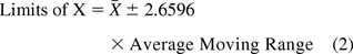
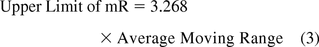
Microbial colonies counted on plates for surfaces (contact plates) and for passive (settling plates) or active (1m3) air sampling are taken to be individual values per site monitored and are evaluated with a chart of individual data (XmR), in contrast to the common average and range chart. On the XmR chart, counts or contamination rates are plotted on the X chart with control limits calculated from the short-term variation estimated from the difference between one data point and the subsequent point (moving range of two, mR) (18). Thus, the average or the median of all consecutive ranges are used to calculate the 3 sigma limits of both the X chart and the mR chart with the following equations:
If the variation is based on the average moving range (10, 11):
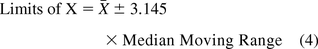
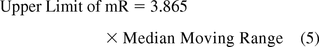
 If the variation is based on the median moving range (10, 11):
Rationale for Using XmR Process Behavior Charts
The approach, originally based on Shewhart and widely interpreted by Wheeler (10, 13) is based on the following main elements:
The 3 sigma limits of the control charts are viewed as empiric limits that include a high percentage of data (10, 12).
Data distribution needs not be normal (12). The above three sigma limits are applicable to all data distributions. Wheeler has calculated that the three-sigma limits of various differently shaped distributions (e.g., normal, exponential, chi-square, etc.) will result in more than 97.5% of the data included within these limits (12) when a process is operated predictably. Often, one attempts to fit a normal distribution to data in order to have 99.73% of the data included between three-sigma limits, entailing only a minute proportion of out-of-control (OOC) data of 0.27%. However, in real processes, the proportion of OOC data is often higher. For instance, the percent of OOC data in the examples evaluated in this paper is 4.3%, 2.0%, 11.5%, and 9.3% of the data recorded. Thus, if one adopts 2.5% as an empirical upper limit of percent OOC data points, then the fit to a normal distribution is not a requirement.
Data need not be transformed to fit a normal distribution (12). Nonlinear transformations can even distort the data, hide the signals, and change the results of the analysis (12).
Basing the control limits on a certain data distribution is valid provided it is shown to remain constant throughout the monitoring of the process (13, 16, 20). For instance, c-charts or g-charts are viable if the underlying distribution parameters remain constant throughout. However, this is often an unrealistic assumption (20). Similarly, the assumption that the average contamination (Poisson distribution) in a site within a clean room is constant when sampled daily or weekly or monthly is most unlikely. This very reason is a good justification per se for not basing control limits of a control chart on the assumed distribution. Instead, the XmR chart captures the process variation from the data as is and derives the empiric control limits (14).
Thus, one can use microbial counts as they are with three sigma limits for generating control charts in order to evaluate the behavior of the EM process.
While controversies over the relationship between control charting and hypothesis testing have been reported and discussed (19), it is critically important to make a clear distinction between inference statistics and statistical process control (SPC) (15). Selecting a proper distribution and goodness-of-fit tests are certainly needed if the purpose is to estimate parameters of the distribution such as the true value and its confidence intervals. However, if the purpose is to be able to monitor the behavior of a process, that is, to be able to state that the process behaves predictably or not, and to be able to point out an OOC situation that may take place at a frequency less than 2.5%, then the empirical process XmR chart is a credible and suitable way to do it.
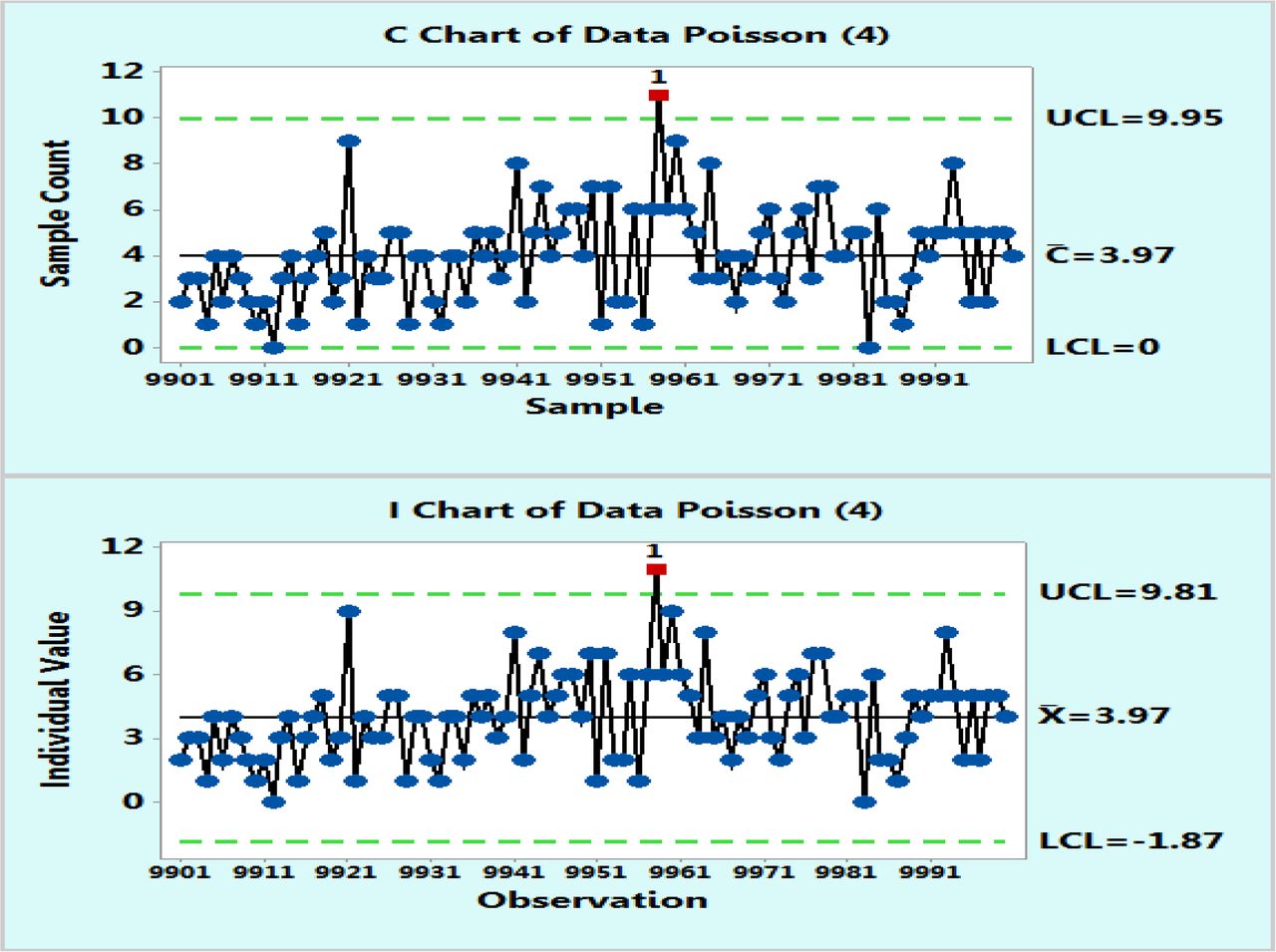
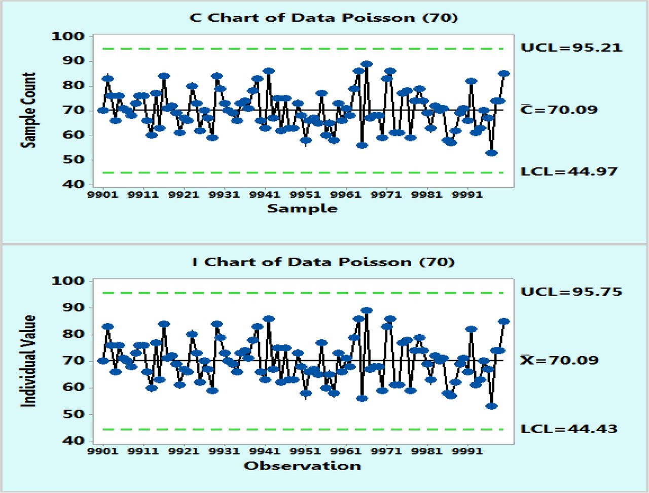
In order to demonstrate the applicability of the XmR charts to microbial counts that follow a Poisson distribution with average counts of 4 cfu or 70, as suggested by Table I, tens of thousands of data points were randomly computer generated with a Minitab 17 and plotted on control charts based on Poisson distributions and as XmR charts. However, for the sake of clarity, Figures 1 and 2 were recorded with only the last 100 data points (9901–10,000) and these figures, just like the complete figures, show that Poisson and XmR charts reveal visibly similar control limits as well as highly similar fractions of OOC data points exceeding the three sigma limits. The exact percentages of these OOC data points were counted from additional control charts plotted with the Minitab 17 for other levels of microbial counts (μ = 1, 4, 13, 30, 70, and 160 cfu) that are expected to represent common bioburden levels in EM samples. Table II lists the results, which happen to be essentially identical for both Poisson and XmR charts.

Poisson chart (upper) and XmR chart (lower) of computer randomly generated 10000 data following Poisson distribution with μ = 4 counts. Only the last 100 data points are shown for the sake of the plot clarity.

Poisson chart (upper) and XmR chart (lower) of computer randomly generated 10000 data following Poisson distribution with μ = 70 counts. Only the last 100 data points are shown for the sake of the plot clarity.
Calculated Percentages of Out-of-Control (OOC) Data Points Exceeding the Upper (UCL) and Lower (LCL) Three-sigma Control Limits in Poisson and XmR Charts of Computer-Generated Random 10000 Data from a Poisson Distribution with Various μ Values
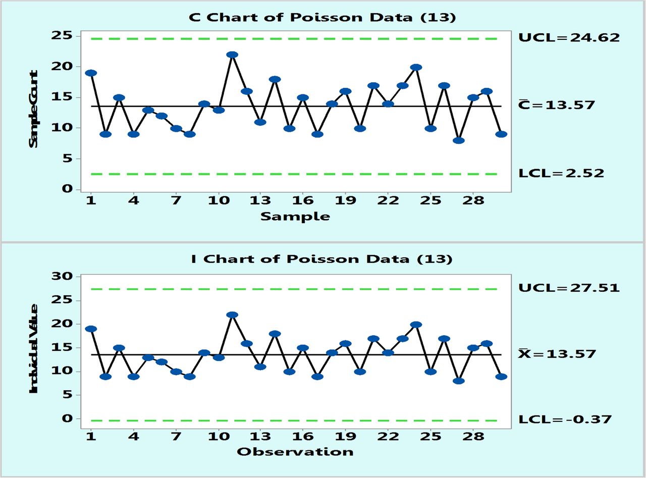
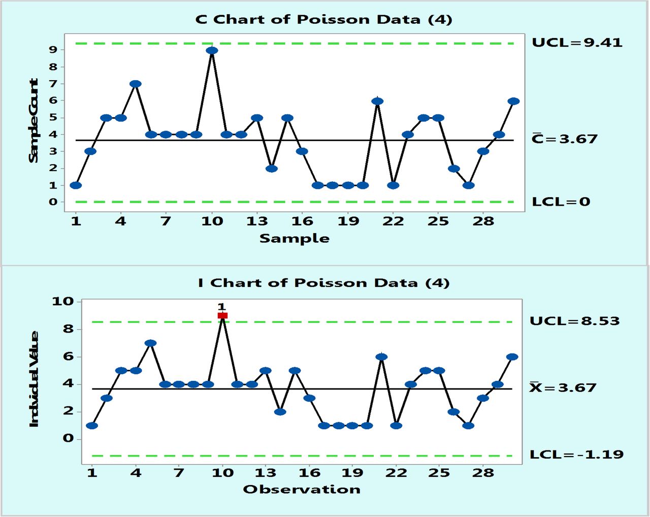
In practice, control charts are initially plotted on a number of data points, typically 20–30, and one can compare the behavior of Poisson and XmR charts drawn from the same data points. Figure 3 is such an example of 30 data points randomly selected from a Poisson population with μ = 13. Obviously, the control limits will differ somewhat as they are calculated differently, but they are similar. The important point is that it may be concluded that the process behaves predictably either according to a Poisson c-chart or to an XmR chart. Occasionally, a borderline data point may appear located close to a control limit in one type of chart and outside the control limit in another type of chart. Such a case is shown in Figure 4, which plots Poisson data with μ = 4: count data point 10 is slightly lower than the upper control limit of the c-chart but slightly above that of the XmR chart. Such an occasional OOC point is not frequent and if it occurs, and it can only prompt an investigation, but the overall behavior of the process conveyed by both types of charts remains essentially the same.

Poisson chart (upper) and XmR chart (lower) of computer randomly generated 30 data following Poisson distribution with μ = 13 counts.

Poisson chart (upper) and XmR chart (lower) of computer randomly generated 30 data following Poisson distribution with μ = 4 counts.
Examples of XmR Control Charts of EM Microbial Counts
Example 1: Microbial Counts in Settling Plates for Passive Air Sampling in Class 100,000
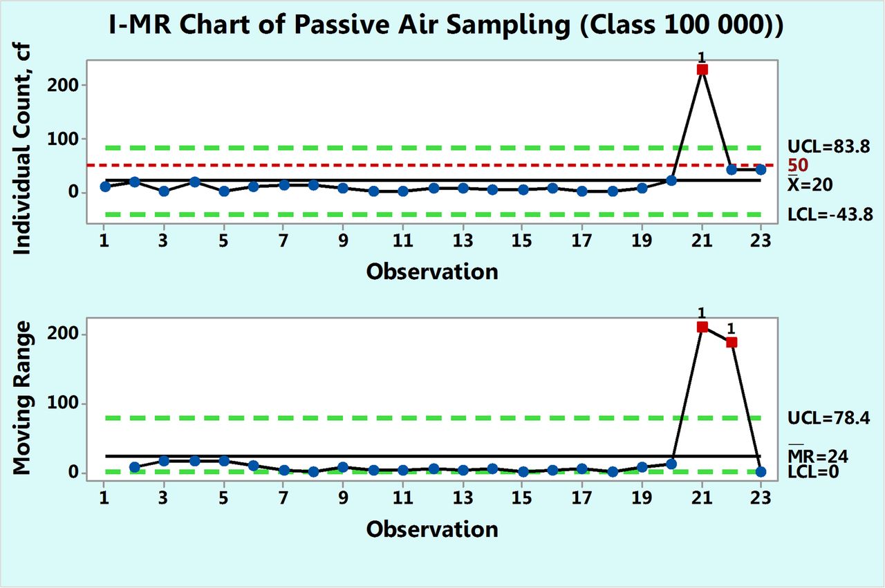
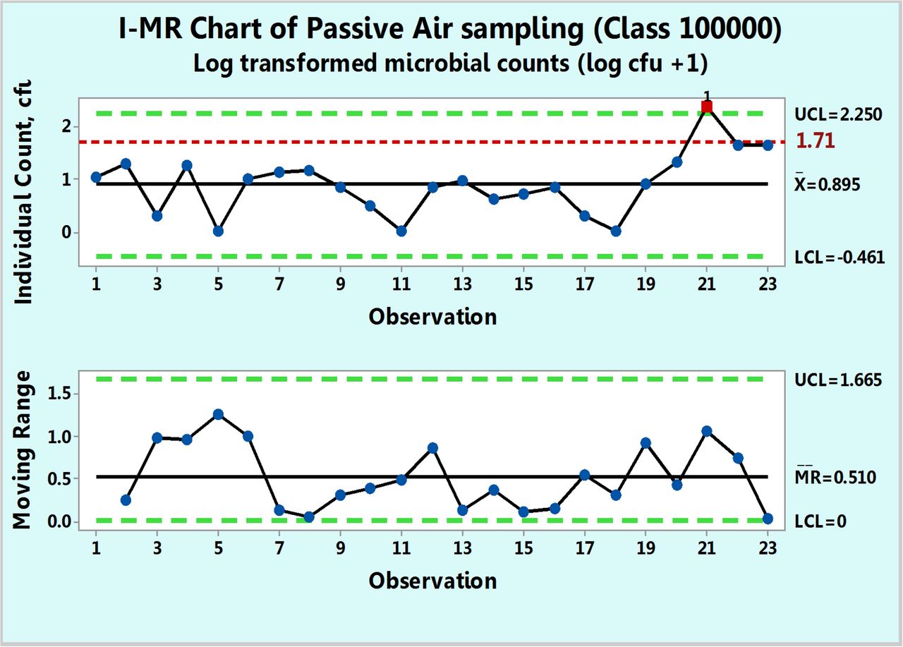
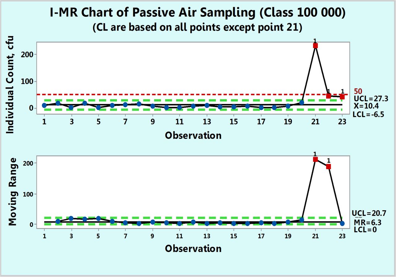
Figure 5 shows microbial of settling plates in a 100,000 class room collected over a period of ten months. Each count is a sum of the individual counts obtained on both Sabouraud's dextrose agar (SDA) and triptic soy agar (TSA) petri dishes. None of the 23 data points follow either Poisson or normal distributions as shown by goodness-of-fit test results of P = 0.00 made with a Minitab 17. Hence, while drawing a c-chart is not justified in this case, one can attempt to apply data transformation and indeed, the data were transformed first with log (count + 1) and plotted in Figure 6 along with a log transformed value of 1.71 as the action limit. Data point 21 is shown to be OOC. The same result is also observed in Figure 5, in which the original counts are plotted on an XmR chart. This figure shows an extreme count of 232 cfu, which is well above the formal action limit of 50 cfu. The XmR chart can be further adjusted to the data values by omitting data point 21 for calculation of the three sigma limits (Figure 7). No counts exceed the upper control limit of 27.3 (∼ 27 cfu) and the control chart shows that the process behaves predictably until observation 20, following which, the two subsequent microbial counts are OOC and call for an investigation. Indeed, the high mR values at the subsequent observations 21 and 22 are OOC data, and this supports the OOC situation detected in the X chart. Since Figures 7⇓⇓–10 are XmR charts, which record counts as they are, a line of a regulatory action limit was added for conveniently signaling a deviation from this limit.

XmR chart of microbial counts of passive air samples recorded in Class 100,000 environment.

XmR chart of log transformed microbial counts of passive air samples recorded in Class 100,000 environment.

XmR chart of microbial counts of passive air samples recorded in Class 100,000 environment after omitting the extreme count of 232 cfu.

XmR chart of microbial counts of passive air samples recorded during one year in area Grade D.

XmR chart of microbial counts of active air samples recorded during one year in area Grade D.

XmR chart of microbial counts of active air samples recorded during one year in area Grade B.
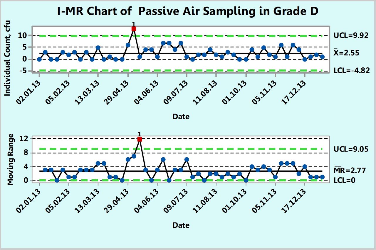
Example 2: Microbial Counts in Settling Plates for Passive Air Sampling in Grade D
Figure 8 shows microbial counts on settling plates collected almost weekly for a 1 year period in a Grade D environment. Each count is a sum of the individual counts obtained on both SDA and TSA petri dishes. Unlike the previous example, the counts here are in general lower and include more zero counts. About 25% of the data are zero and this usually makes a fit to either a Poisson or normal distribution less likely. Indeed, none of the 49 counts follow either Poisson or normal distributions as shown by goodness-of-fit test results of P = 0.00 made with a Minitab 17. Furthermore, conversion of the data with log (count + 1) or square root (count + 0.5) transformations did not normalize the data, as evidenced by the resulting P-values, which are lower than 0.05. Once again, one can directly plot the original counts onto an XmR chart and obtain a plot that depicts realistically the behavior of the microbial monitoring process in this Grade D environment. Indeed, Figure 8 shows a well-behaved microbial monitoring process of the specific site monitored, which does not exceed an upper limit of 9.92 cfu (∼10 cfu) except for a single OOC data point at 17. One can recalculate the control limits disregarding this OOC point and obtain a slightly narrower upper limit of 8.92 cfu (∼9 cfu). In either case, the counts are well below the regulatory action limit of 100 cfu.
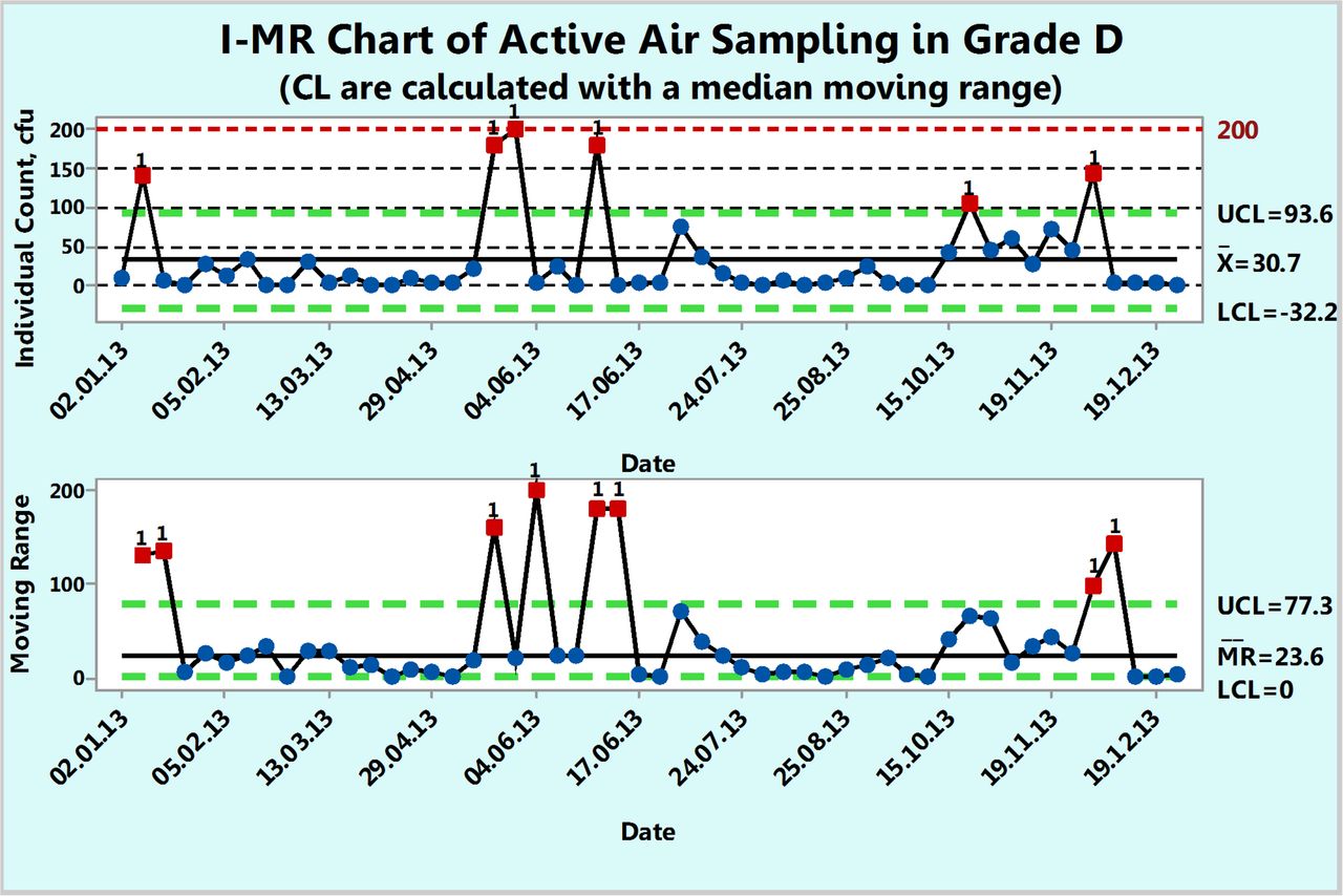
Example 3: Microbial Counts in Settling Plates for Active Air Sampling in Grade D
Figure 9 shows microbial counts on TSA plates collected almost weekly with a microbiological air sampler during a 1 year period in a Grade D environment. About 23% of the data are zero and again, this usually makes a fit to either a Poisson or normal distribution less likely. Indeed, none of the 52 counts follow either Poisson or normal distributions as shown by goodness-of-fit test results of P = 0.00 made with a Minitab 17. Furthermore, conversion of the data with log (count + 1) or square root (count + 0.5) transformations did not normalize the data as evidenced again by the resulting P-values, which are lower than 0.05. So, Figure 9 is an XmR chart with the control limits calculated from a median range (eqs 4 and 5) in order to minimize the impact of the extreme counts rather than with the usual averages range (eqs 2 and 3). One can also decide to draw the control limits with all high counts disregarded.
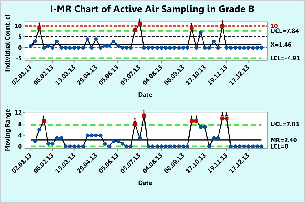
Example 4: Microbial Counts in Settling Plates for Active Air Sampling in Grade B
Figure 10 shows microbial counts on TSA plates collected almost weekly with a microbiological air sampler during a 1 year period in a Grade B environment. About 68.5% of the data are zero and again, this usually makes a fit to either a Poisson or normal distribution much less likely. As in the previous example, none of the 54 counts follow either Poisson or normal distributions of original or transformed counts, as shown by goodness-of-fit test results of P = 0.00 made with a Minitab 17. The number of noncontaminated samples (count = 0) is so large that the average count may now get closer to 1 cfu or can become <1 cfu. In the latter case, whenever the average count is <1, the XmR chart becomes inefficient for interpreting a control chart (16). An attempt to re-draw the XmR chart with all the OOC data points (data points 3, 25, 26, 38, and 45) omitted in the calculation of the control limits makes the average count <1 (average count = 0.65 cfu). Under these conditions, one can switch to a different approach that is based on evaluation of contamination as a rare event.
Evaluation of Contamination Rates of EM Samples for Cases of Rare Contaminations
When the majority of the EM samples show no microbial growth, as is the practical and regulatory expectation from environments of Class 100, Grades A and B, then the occurrence of a single contaminated plate becomes a special event, a rare event. Other examples of rare events include hospital-acquired infections, medication errors, or rare deviations in manufacturing processes. In EM, a contaminated sample is viewed as a rare event, irrespective of whether its shows, for example, 1, 5, or 15 cfu. Thus, instead of monitoring the very few contamination events, one can track the values that follow.
a. The Number of Noncontamination Opportunities between Contamination Events
This number is used to generate a g-chart (based on geometric distribution) or the time elapsed between contamination events to generate a t-chart (based on either Weibull or exponential distributions) (17).
These control charts for rare events are available in commercial statistical software programs but prior to their use, the data need to demonstrate a goodness-of-fit. In any case, as explained above, the use of these special control charts assumes a constant underlying probability of the given distribution throughout the long period of EM data collection. Since this is taken to be unrealistic, this possibility is not followed in this paper.
b. The Percent Microbial Contamination Recovery Rate
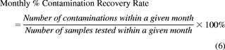
This metric, as previously mentioned, was recently suggested by USP <1116>. The recommended maximal rate limits for the various International Organization for Standardization (ISO) classified environments for production of sterile products are <1%, <3%, <5%, and <10% for ISO 5, 6, 7, and 8, respectively. USP <1116> states that the actual monitoring data should be retabulated monthly. The monthly contamination rate is given by:
 The cumulative contamination rate can be calculated with:
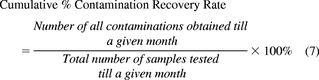 where the total number of samples includes those of the given month.
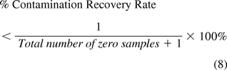
The contamination recovery rate, expressed as a cumulative percentage of contaminated EM samples from all tested samples can be updated at least monthly and tabulated or plotted as a function of time. But, the monthly (or weekly) recovery rates determined with eq 6 can also be plotted on an XmR chart to evaluate the environmental process performance as expressed by either a decrease or an increase in the monthly contamination rate, a trend upward or downward, or a stable behavior within control limits. In Class 100 and Grade A environments, the counts are expected to be mostly zero, and many times all counts are zero. In the latter case, one can only state that the percent contamination recovery rate is estimated with:
While the USP <1116> limits of contamination recovery rates appear to be suitable to ISO 5 and 6 or Grade A and B environments, where contamination is expected to be rare, they appear to be rather very stringent for the ISO 7 and 8 environments. The newly revised Parenteral Drug Association (PDA) technical report states indeed that the recovery rates for ISO 7 and 8 environments may not be obtainable. Indeed, a recovery rate limit of 10% for ISO class 8 (class 100000) implies that 90% of the samples tested should show no growth despite the fact that they are sampled from a nonsterile environment. In any case, PDA Technical Report 13 makes the wise suggestion that if one wishes to track the recommended recovery rates, it should be done parallel to the presently binding regulatory action limits (7).
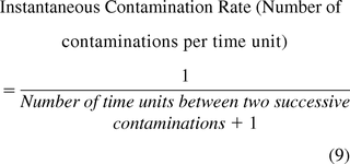
c. The Instantaneous Contamination Rates
The instantaneous rate may be determined as the number of contaminations per a unit of time (e.g., day, week, month) if EM samples are tested regularly with time. The rate is instantaneous when calculated from the number of unit times elapsed from the previous contamination to the present one (including the time unit where the contamination occurred) (17) and is expressed as the number of contaminations per unit of time (eq 9) or as the number of contaminations per 100 time units (eq 10).
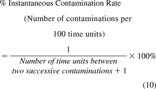
If EM samples are not tested regularly with time, then the instantaneous rate is expressed as the percent of contaminated samples from the number of all samples tested since the last contamination during the specified time period, using eq 11.
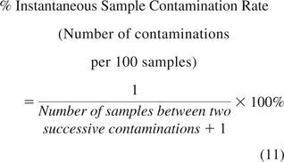
It is worth noting that while eq 6 determines the percent of contaminated samples obtained within a month from all samples tested during that month, eq 11 expresses the percent of contaminated samples per 100 samples from the previous contamination to the present one. Plotting the instantaneous rates (from eqs 9, 10, or 11) on XmR charts again allows one to depict the monitoring process behavior, informing when the performance improves (lower contamination rate), diminishes (higher contamination rate), trends upward or downward, or behaves predictably.
Examples of Charting of EM Contamination Rates
Example 5: Microbial Contamination Recovery Rate in Settling Plates for Active Air Sampling in Grade B
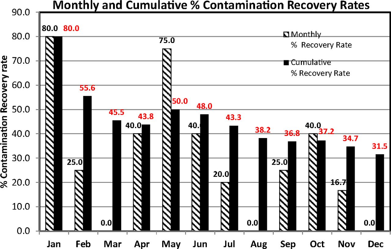
The data set that was plotted on an XmR chart (Figure 10) is reanalyzed to evaluate the percent contamination recovery rates as suggested by USP <1116>. The high proportion of zero counts renders the data set more suitable for a direct evaluation of the percent incident and cumulative sample rates of contaminations. Accordingly, the counts of the Grade B area, plotted in Figure 10, are regrouped per month and the monthly percent and the cumulative sample rates of contaminations were calculated with eqs 6 and 7, respectively. These are listed in Table III and plotted in Figure 11 for better visualization.
Percent Monthly and Cumulative Percent Contamination Recovery Rate Calculated per USP <1116> on Microbial Counts of Active Air Sampling in Classified Area Grade B

Monthly and cumulative contamination recovery rates (per USP <1116>) calculated from the microbial counts of active air samples recorded during one year in area Grade B (see Table III).
In this specific case, the rates are quite high, in contrast to the much lower USP limits of <1% or <5% if Grade B is equated to ISO 5 (at rest) or ISO 7 (in operation) classes, respectively. Interestingly, only one count (11 cfu) exceeds the EU GMP limit of 10 cfu, showing again that the USP approach is certainly more stringent. The cumulative sample contamination rate may decrease or increase from month to month and this behavior is explained when the monthly rate is also simultaneously evaluated. For instance, the cumulative rate dropped from 55.6% in February to 45.5% in March because no contaminated samples were detected during March. Instead of tabulated data, a chart such as Figure 11 has the advantage of an easier visual display of data behavior. The calculated numbers of the contamination rates are also annotated on top of the columns in the chart.
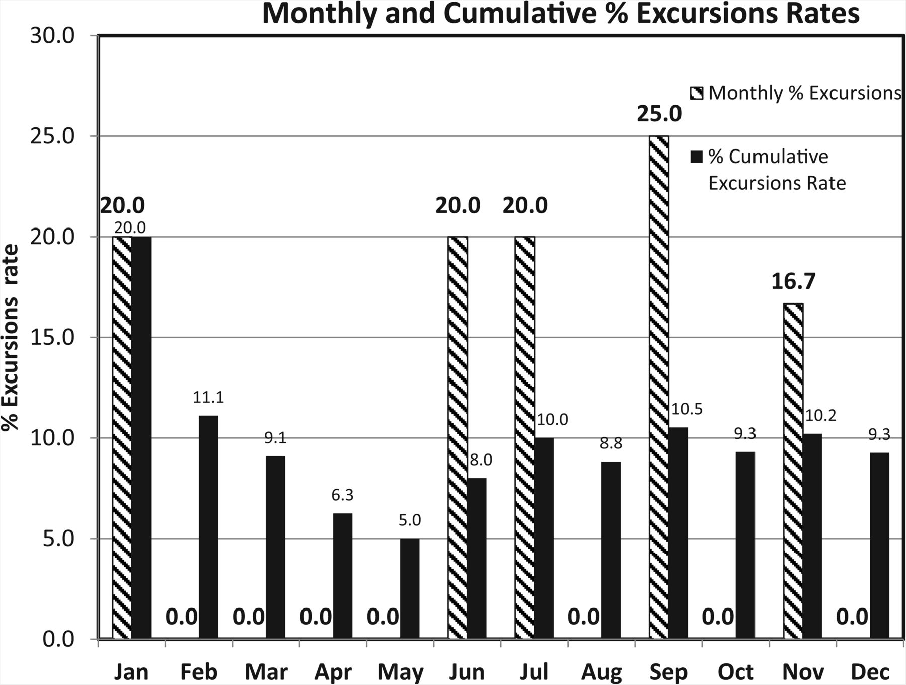
PDA technical report 13 (7) suggests monitoring the excursions rate as well, that is, the fraction of the samples exceeding the alert limit and/or action limit. Table IV lists the monthly number of EM samples exceeding the alert and action limits among the same data set presented in Table III for Grade B. Figure 12 is a visual display of the percent excursions rate and it is seen that each decrease of the monthly rate entails a decrease of the corresponding cumulative excursions rate.
Percent Monthly and Cumulative Excursions Rate of Microbial Counts of Active Air Sampling in Classified Area Grade B

Monthly and cumulative excursions (above Alert and Action limits) rates calculated from the microbial counts of active air samples recorded during one year in area Grade B (see Table IV).
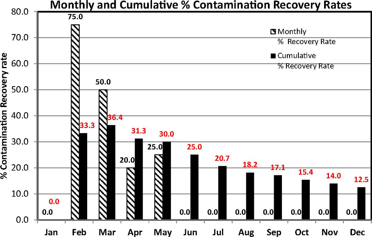
Example 6: Microbial Contamination Recovery Rate in Contact Plates in Grade C
This example depicts recovery rates for contact plates in classified area Grade C. The contact plates are both SDA and TSA plates and any single contaminated plate is taken as a contamination event. The recovery rates were calculated according to USP guidance with eqs 6 and 7 and are plotted as a column chart in Figure 13. This figure reveals a clear decreasing trend of cumulative recovery rates and this is explained by the absence of contamination during the months June–December (the monthly recovery rates are zero). Interestingly, despite the high recovery rates, all counts (not shown) were below the EU GMP limit of 25 cfu.

Column graph of monthly and cumulative contamination recovery rates (per USP <1116>) calculated from contact plates recorded during one year in area Grade C.
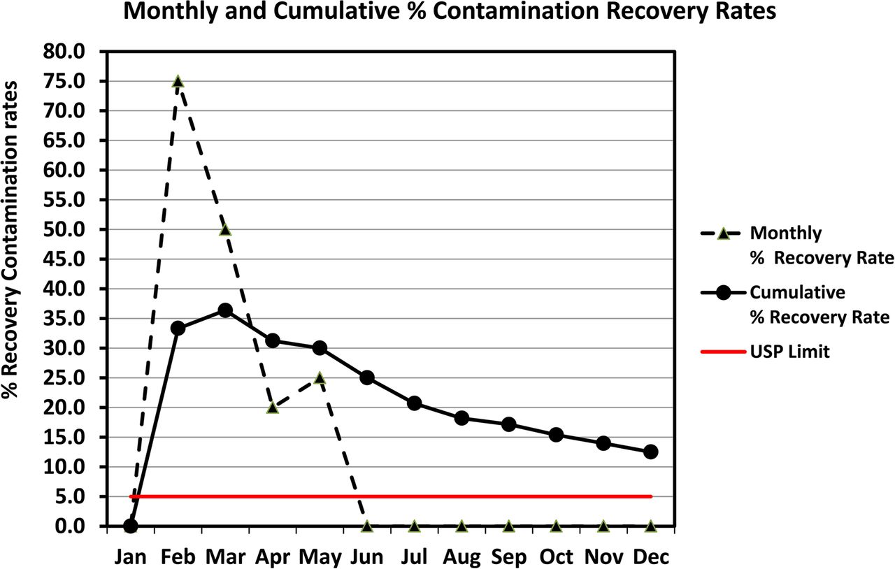
Alternatively, one may prefer to plot the same recovery rates in a line chart rather than in a column chart in order to visualize better any existing trend. This is shown in Figure 14 along with a USP limit of 5% if Grade C is equated to ISO class 7 (at rest). If additional data of the subsequent year are plotted on the same chart and the contamination events remain rare, the curve of the cumulative recovery rate will continue its trend downward and meet the USP limit.

Line graph of monthly and cumulative contamination recovery rates (per USP <1116>) calculated from contact plates recorded during one year in area Grade C (same data as Figure 13).
Example 7: Instantaneous Sample Contamination Rates in Contact Plates in Grade D
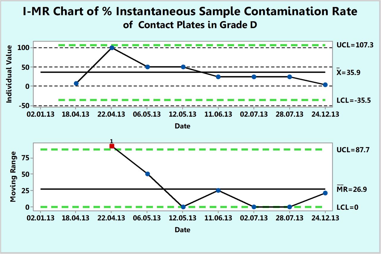
As previously explained, the instantaneous rate refers to a rate between two successive contamination events. This is often applicable for cases of rare events as expected in the classified environments of Class 100, ISO 5, or Grade A. However, this usually requires many data points across several years in order to calculate instantaneous rates between two rare contaminations. Counts in contact plates in the Grade D area are used to illustrate the calculations and the charting even though the contamination is not rare enough. Table V lists the number of noncontaminated samples between two successive contaminated samples as well as the instantaneous sample contamination rate, expressed per 100 samples, that was calculated with eq 11. These rates are plotted in Figure 15 and show how the contamination rate (number of contaminations per 100 samples tested) varies with time and that on the average, 36 contaminations occur every 100 samples. If one omits data point 3 (date of 22.04.13) for calculating the control limits, one would obtain a lower contamination rate with narrower control limits.
Instantaneous Sample Contamination Rates in Classified Area Grade D*

Percent instantaneous sample contamination rates (number of contaminated samples per 100 samples tested) calculated from contact plates recorded during one year in area Grade D (see Table V).
Example 8: Instantaneous Contamination Rates in Contact Plates in Grade D
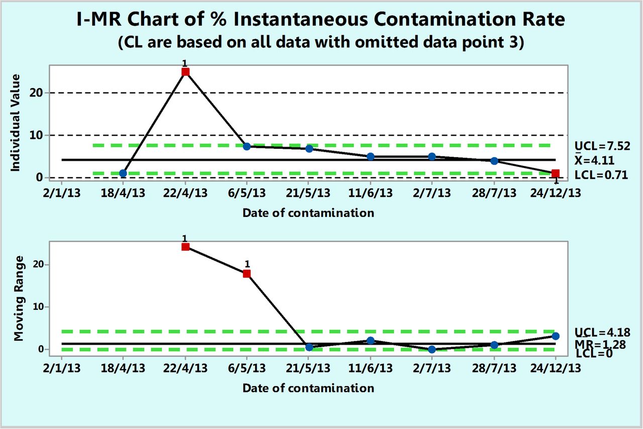
Fundamentally, rate is expressed per a unit of time and one can plot the number of contamination events per a unit of time (e.g., per day). The dates in Table V are contamination dates and one can calculate the number of days elapsed between two contaminations. Table VI lists the number of days until the next contamination (inclusive of the contamination day). The instantaneous contamination rate (per day) calculated with eq 9 and the instantaneous percent contamination rate (per 100 days) calculated with eq 10 are listed in Table VI. Either rate can be plotted on an XmR chart and the percent contamination rate is shown in Figure 16. When the extreme data point 3 (at 22.04.13) is ignored, the chart shows that, on average, 4.11 contaminations occur every 100 days.
Example of Instantaneous Contamination Rates in Classified Area Grade D*

Percent instantaneous contamination rates (number of contamination events per 100 days) calculated from contact plates recorded during one year in area Grade D with the extreme rate omitted (see Table VI).
Conclusions
A simple statistical process control tool, the XmR chart of individual values, can be used to plot and depict the behavior of the environmental microbial monitoring process. To this purpose, microbial counts of environmental samples are plotted as they are, irrespective of the parent data distribution and with no need to undergo a mathematical transformation. The three-sigma control limits, computed from the moving ranges that capture the short-term process variation, include at least 97.5% of any parent data distribution, and any microbial count point beyond these limits is taken to be a rare occurrence and considered to be an OOC point. Microbial counts from passive or active air sampling in area Grade D or B or Class 100,000 were employed to construct XmR charts.
When microbial contamination becomes a rare event as in classified areas of Grade A or B or ISO 5, instantaneous rates of contamination between two successive contamination events, expressed per unit of time or per sample tested, can be plotted on an XmR chart that depicts the behavior of the microbial monitoring process. Alternatively, monthly and cumulative sample contamination recovery rates, suggested recently by USP <1116>, can be plotted in column or line charts that allow a visible evaluation of any existing trend. Examples of plots of these sample contamination recovery rates as well as of rates of excursion beyond alert and action limits are given for microbial counts of active air samples in area Grade B and contact plates in area Grade C, all recorded during 1 year.
- © PDA, Inc. 2015
References


Jump to section
- Article
- Abstract
- Introduction
- Common Bioburden Levels of EM Samples
- XmR Charts of Microbial Counts
- Rationale for Using XmR Process Behavior Charts
- Examples of XmR Control Charts of EM Microbial Counts
- Evaluation of Contamination Rates of EM Samples for Cases of Rare Contaminations
- Examples of Charting of EM Contamination Rates
- Conclusions
- References
- Figures & Data
- References
- Info & Metrics